The formatting of numeric values on charts and in tables can be customised using these formats:
- Compact: a condensed, rounded format. For example, 17,434 would be shown as 17K
- 2 decimal places: the number is rounded to 2 decimal places
- Percentage: a value between 0 and 1 is converted to a percentage. This is the same behaviour as the % formatting function in Excel.
- Separated: comma thousands separators are added to large numbers. No decimal places are shown
- Seconds to HMS: converts a seconds value to hours, minutes and seconds
The most common formatting used in the chart library is separated for counts and percentage for scores and proportions.
Applying to charts
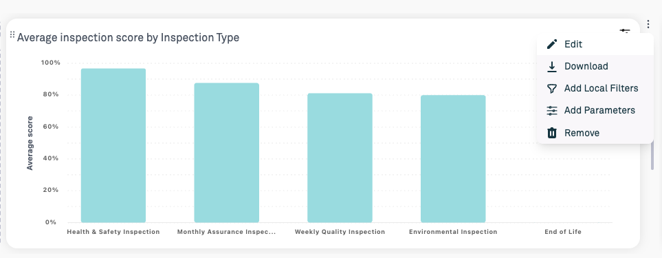
1. Click the edit button next to the chart
2. Select the Format tab
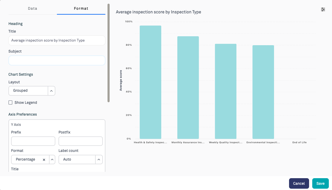
3. Under the Y axis options, select the desired formatting function in the format field. This can also be applied to the X axis when needed.
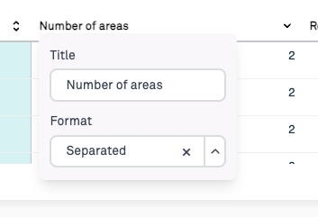
Applying to tables
1. Click on the column header that you wish to apply the function to.
2. A small popup will appear which gives an option to change the label of the column and the formatting function used.
Was this article helpful?
That’s Great!
Thank you for your feedback
Sorry! We couldn't be helpful
Thank you for your feedback
Feedback sent
We appreciate your effort and will try to fix the article